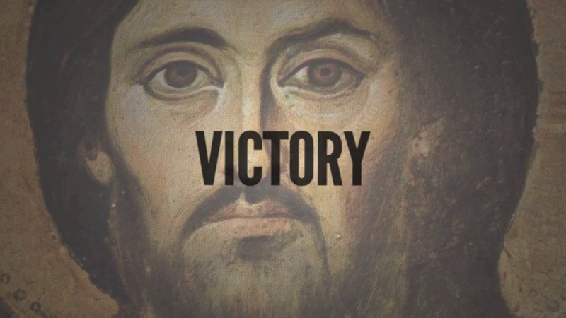
Sometimes you have to laugh at yourself.. Hahaha.!!
Cause all this time I have assured myself that when it comes to cover-art, our creative story-telling genius is as clear as day for all the world to see; communicating the timeless message of Christ in such grandeur clarity and relevance that it’s impossible not to find redemption simply by looking at the front cover of our albums; graphical design so deep and complex that it speaks eternal truths to the soul through the iris’s of all who are privileged enough to set eyes upon such visual masterpieces. HA! Think about it; 2004; “MORE THAN LIFE” - a clip-art-extravaganza which involved hundreds of meticulous hours spent cutting out images of people in our youth ministry and zoo animals and other random objects that represented all that life entailed to us at the time.. And above it all we blasted the word “UNITED’ and had some random images of musicians worshipping our God, so as if to visually declare “ohhh I looove yoouu.. Moooooore than liiiiiife”.

I mean for real.. It was brilliant!! And yet, in response, all we got was a hundred angry emails about how in amongst the plethora of layered images there was a particular image of MGC (Michael Guy Chislett) making a symbol that apparently represented the devil!!!


Labels